Images play a bigger role in your website’s clarity than most people realize. If you’ve ever wondered how to make your website images accessible—or what to actually do with alt text, decorative graphics, or Canva visuals—this guide will walk you through it.
Accessible images aren’t about perfection. They’re about clarity. When your images are handled thoughtfully, they support your message instead of quietly getting in the way.
Images do more than decorate a page. They communicate, and depending on how they’re handled, they either support your message… or quietly create friction. Let’s walk through how to make your images accessible in a way that’s practical and manageable.
What Accessible Images Actually Mean
At its core, accessible images come down to something simple:
If an image communicates something important, that information needs to be available in a way everyone can access.
If the image is decorative, it shouldn’t get in the way. If it carries meaning, that meaning needs to be available beyond the visual.
Accessibility standards require text alternatives for non-text content, but you don’t need to memorize the rules. You just need to understand the type of image you’re using. That’s where most issues begin.
This is just one piece of a larger accessibility picture—but it’s one of the easiest places to start.
The 4 Types of Website Images
Most image accessibility issues happen because these categories get mixed up. Once you understand the four types of images that show up on websites, everything becomes simpler.
1. Decorative Images
Decorative images don’t add information. They add mood or visual structure—things like watercolor backgrounds, divider lines, abstract textures, or subtle pattern overlays. If you removed the image, the meaning of the content would stay the same.
Recommended implementation:
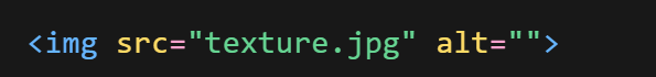
This is what an empty alt attribute looks like when an image is purely decorative. That empty alt (nothing between the quotation marks, alt=””) tells screen readers to skip it.
The goal here is simple: if an image doesn’t add meaning, it doesn’t need to be described.
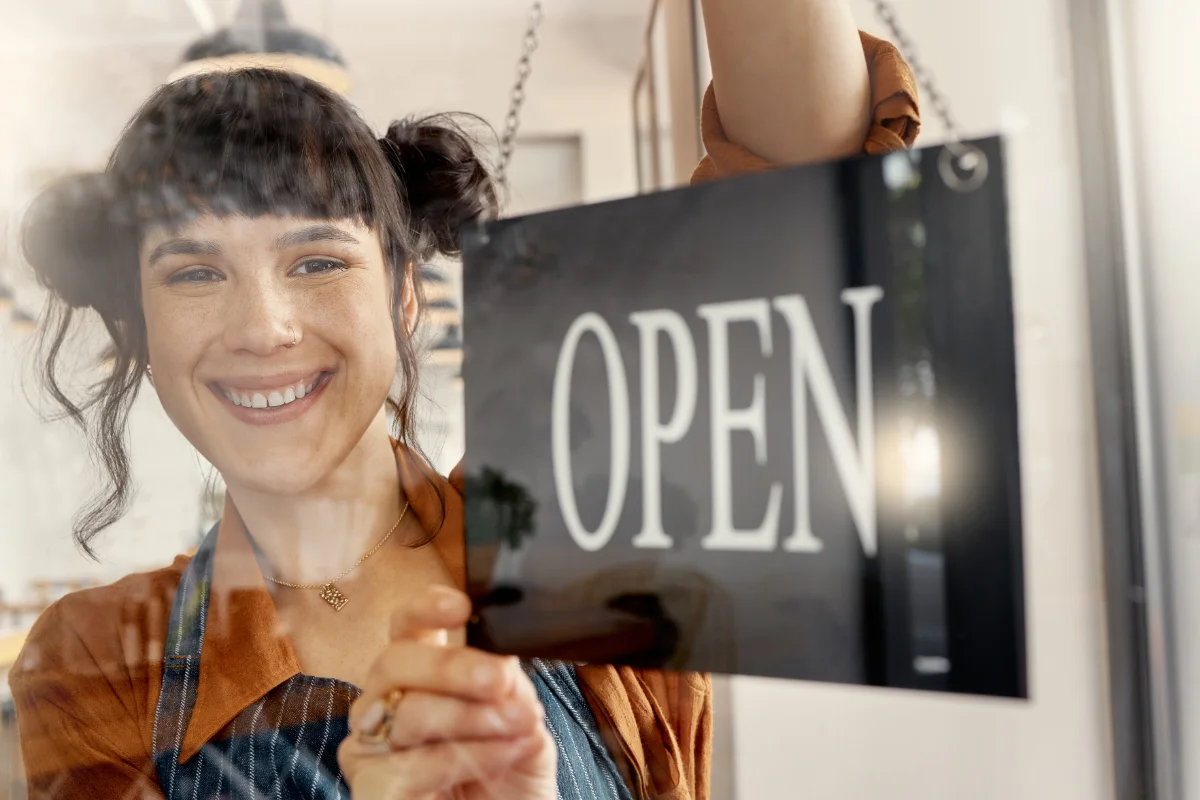
2. Informative Images
Informative images are there for a reason—they’re adding context, not just decoration. And whether they actually add meaning depends on how they’re being used on the page.
For example:
- A photo of you speaking at a workshop used on your media page
- A screenshot showing how something works on a post about that topic
- A product image on a sales page for that product
- A team photo on your about page
In each of these cases, the image is doing something. It’s helping someone understand what they’re looking at or why it matters. So instead of labeling the image, your alt text should reflect that context.
For example, if I had an image of me speaking at an accessibility workshop, with an audience of small business owners and signage showing it’s an accessibility workshop:
Weak alt text: alt=”speaker”
Better alt text: alt=”Jackie Barker presenting a website accessibility workshop to small business owners”
One thing to keep in mind—you’re describing what’s actually visible in the image, not adding extra context that isn’t there. If the image didn’t clearly show that it was an accessibility workshop, you wouldn’t include that in the alt text.
The second version works because it adds context and reflects what the image is actually contributing to the page.
Alt text isn’t a label—it’s a replacement.
If someone couldn’t see the image, would they still understand what it contributes? That’s the test.
If you want to see more examples of how this works in practice, this breakdown of good and bad alt text is a helpful reference.
3. Functional Images
Functional images act like buttons or links—things like social media icons, search icons, download buttons, or navigation graphics.
With these, describe the action, not the appearance. For example, an Instagram icon in your footer:
Wrong: alt=”Instagram logo”
Better: alt=”Follow us on Instagram”
The user doesn’t need to know what it looks like. They need to know what it does.
Pro Tip: Sometimes people design buttons as images and upload them to their site. It might look the same visually (if you’re lucky), but it changes how the element actually works. A better approach is to use a real button and style it to match your design. That way it stays accessible, responsive, and easy to interact with.
4. Complex Images
Complex images include charts, graphs, infographics, and data visualizations. These carry layered information.
For these, alt text should summarize—not explain every detail.
Example: alt=”Line chart showing steady website traffic growth from January to June”
Then include a visible explanation below the chart that walks through the key points. Alt text gives the overview. Body text provides the details.
If the data matters, it needs to exist outside the image.
How to Write Alt Text Without Overthinking It
Alt text feels intimidating until you realize it’s simply about clarity. This is really the foundation of accessible images.
A helpful way to think about it is: What is this? What matters? Why is it here?
When an image is being used to support what you’re explaining, your alt text should reflect that purpose.
For example:
If you’re talking about reviewing or improving a website:
A woman reviewing a website layout on her laptop
→ alt=”Business owner reviewing website layout on her laptop”
If you’re sharing a message or reinforcing a key idea:
A Canva quote graphic that says “Your work deserves to be seen”
→ alt=”Quote reading Your work deserves to be seen”
If that quote also appears as real text on the page, you don’t need to repeat it fully in the alt text. Context matters. This is something I see come up a lot in branding and graphic design—especially with Canva graphics and quote images.
If you’re walking someone through a process or showing what something looks like:
A screenshot of a website audit checklist
→ alt=”Website accessibility checklist displayed on a laptop screen”
These aren’t one-size-fits-all descriptions—they work because they match how the image is being used on the page.
The Biggest Accessibility Mistake I See
The biggest issue I see? Text trapped inside images. This shows up all the time—especially with Canva graphics.
If you design a beautiful hero image with the headline embedded inside it, it might look great visually. But structurally, it creates problems.
Screen readers can’t read that text unless you describe it. And even then, it won’t behave like real text.
A better approach is to use real text layered over the image background. That way it scales on mobile and can be styled to maintain good contrast and readability. This is one of those small structural decisions that makes a big difference in how a site actually functions—and something I prioritize when designing and building websites.
The same goes for quote graphics. If the quote matters, include it as real text on the page—not just inside the image.
And when it comes to buttons, function should be built with code. Graphics should enhance structure, not replace it.
Image Size and Load Speed Matter Too
Accessibility isn’t only about screen readers—how your site performs matters too. A 3MB hero image might look crisp on your desktop, but on mobile data, it can slow everything down. If your images are too large, your site slows down—and that affects how people experience it.
Optimizing your images removes that barrier.
For example, compressing a large JPG into a WebP under 300KB can maintain the same visual quality while dramatically improving load speed.
Clarity includes performance.
Quick Image Accessibility Check Before You Publish
Before uploading any image to your website, take a second and ask:
- Is this decorative or informative?
- If it’s informative, does the alt text describe its purpose?
- Is any important text trapped inside the image?
- Is the file size reasonable?
- Can someone read it clearly on mobile?
When you start thinking about accessible images this way, everything becomes a lot simpler.
Why This Matters for Your Business
Accessible images aren’t about perfection. They’re about clarity.
When your images load quickly, read clearly, and are described thoughtfully, your website feels intentional, professional, and calm. And that builds trust faster than most people realize.
If you’re not sure whether your images are helping or quietly working against you, this is exactly the kind of thing we look at inside a website audit.