Your website isn’t just pixels and code. It’s often the first place someone goes to figure out who you are and whether they trust you.
Long before anyone clicks “book now,” your site is already quietly doing work in the background—shaping how people feel, how clearly they understand what you offer, and whether they want to keep exploring.
When your branding is aligned, your website stops feeling like a collection of pages and starts feeling coherent. Not flashy. Not performative. Just clear, grounded, and easy to engage with.
If you’re realizing your website issues are actually brand issues, this is exactly the kind of work I do through my spiritual branding services.
And while alignment can feel intangible — especially in a soul-aligned business — it shows up in very practical ways: how readable your site is, whether your words sound like you, and whether each page makes sense to someone seeing your work for the first time.
The goal isn’t perfection. It’s a website that looks like you, sounds like you, and actually supports your business.
What Is Website Branding and Why It Actually Matters
Most people think branding is about logos, colors, and fonts—and yes, those things matter.
But branding is really about how clearly your website communicates who you are and who it’s for. It’s the tone of your words. The choices behind your images. The way everything works together to help someone feel oriented instead of confused.
When branding is working, visitors don’t have to work hard to “get” you. They understand what you do, they recognize themselves in the language you use, and they can quickly tell whether they’re in the right place.
That clarity matters even more for people doing heart-centered or creative work, where trust and connection play a big role in the decision to reach out. If your site feels disjointed or generic, it creates friction—even if your work itself is solid.
Branding isn’t about being louder or trendier. It’s about making it easier for the right people to recognize you.
Related: Color Psychology for Branding That Speaks to the Soul
Common Branding Mistakes That Throw Your Website Out of Alignment
You’re not basic. So your brand shouldn’t feel like a dressed-up template.
Here are a few website branding choices that tend to cause problems:
- Colors that look fine on their own but don’t actually work together on a real screen
- Fonts that fight the tone of your message (a gentle voice paired with a harsh typeface is jarring)
- Stock photos that feel generic or corporate when your work is personal and relational
- Copy that sounds “professional,” but doesn’t sound like you would in an actual conversation
When these pieces don’t line up, people feel it. They may not be able to name what’s off, but hesitation shows up anyway—shorter visits, fewer clicks, and a quiet decision to keep looking elsewhere.
Website Branding Tips That Actually Work
Let’s strip this back and make it useful.
Get Clear on What Your Brand Is Communicating
Before you touch colors, fonts, or layouts, website branding starts with clarity.
I see a lot of sites where everything looks “fine,” but nothing quite clicks. Usually, it’s because the brand hasn’t been clearly defined beyond a general vibe.
Instead of asking what looks good, ask: “What do people need to understand about my work within the first few seconds?“
When someone lands on your site, they’re trying to orient themselves quickly. They want to know:
- what you do
- who it’s for
- whether it feels like a fit
If your website branding doesn’t answer those questions clearly, the details won’t matter — no matter how beautiful they are.
Think about the words clients actually use when they describe you, not the ones you wish they’d use. Listen to how people talk about your work in emails, testimonials, or conversations. That language is often far more accurate (and more usable) than anything we invent in a branding exercise.
Once you have that clarity, your colors, imagery, and copy have something solid to support — instead of trying to do all the work themselves.
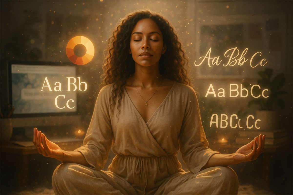
Choose Colors and Fonts That Reflect Your Energy
Colors and fonts do more work than most people realize. They affect readability, trust, and whether someone feels comfortable staying on your site.
I often see websites where the color palette itself is beautiful — the issue isn’t the colors, it’s how they’re being used. Too much contrast in the wrong places, text sitting on busy backgrounds, or brand colors doing jobs they weren’t meant to do.
Even a great palette can feel overwhelming if it’s not applied thoughtfully across headings, body copy, buttons, and backgrounds. When that happens, people don’t consciously think “this is hard to read” — they just leave.
Typography plays the same role. A soft serif communicates something very different than a bold, all-caps sans-serif, and those choices shape how safe, calm, or confident your site feels to the people reading it.
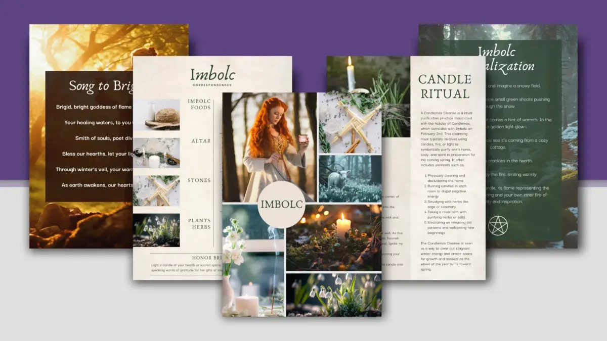
Use Imagery That Feels Like You
You don’t need a six-figure photoshoot. You do need images that actually reflect how you work and how you show up.
If it’s within reach, a brand shoot can be incredibly helpful — especially if the photographer understands your work and isn’t just chasing “aesthetic.” The goal isn’t perfect poses. It’s capturing you in motion: working, thinking, creating, connecting. Real light. Real spaces. The version of you your clients would recognize if they walked into the room.
Pro tip: Create a shot list based on your client journey. What do people need to feel at each stage? Calm? Inspired? Empowered? Design your shoot to reflect those emotions.
If a shoot isn’t doable yet, that’s okay. Stock imagery can work — as long as it’s chosen intentionally. The problem isn’t stock photos themselves. It’s stock photos that don’t match your values, your tone, your aesthetic, or how you actually work.
A few things that tend to work better than generic wellness imagery:
- Hands in motion (rituals, writing, creating)
- Realistic workspaces (studio, home altar, desk)
- Objects with meaning (crystals, coffee mugs, tarot cards only if they’re your actual tools—not just trendy props)
The goal is consistency. When someone moves from your homepage to your services page to your contact page, the visuals should feel like they belong to the same person and the same business.
Speak in Your Natural Voice
No more “professional voice” nonsense. If you’re soft-spoken, let your copy whisper. If you’re a firestarter, let your words roar. Your soulmate clients don’t want the perfect phrase. They want your truth. They want to recognize you. If your copy sounds smoother than you do in real life, that disconnect matters.
One of the biggest disconnects I see is when someone’s website sounds smoother, smarter, or more elevated than they do in real life. People feel that gap, even if they can’t name it.
A simple check that usually surfaces this fast:
read a paragraph out loud.
If it doesn’t sound like something you’d actually say, that’s where the revision needs to happen.
Align the Flow of Your Website With the Client Journey
Branding isn’t just about visuals—it’s also about structure. Your homepage is usually the first conversation. Your About page builds trust. Your services page answers “is this for me?” Your contact page should feel like a clear next step — not a leap.
When the flow works, people don’t have to think very hard about what to do next. They just instinctually know. When it doesn’t flow, they lose momentum or worse yet, click away to a different site.
As you review your site, ask:
- What do I want someone to understand on this page?
- What do I want them to do next?
- Does this feel like a natural progression, or a hard pivot?
When those answers feel fuzzy or inconsistent, the issue usually isn’t design—it’s how someone moves from one page to the next.
Want a second set of eyes? Try our Website Comparison Checklist to spot what’s getting in the way.
How to Tell If Your Website Branding Is Working
Sure, you can track bounce rates, time on page, and conversion goals—and you should. Those numbers are simply showing you how people are responding once they land on your site.
But you’ll often notice the shift in more human ways first.
People say things like, “Your site feels like home.”
Clients come in already understanding what you do.
You stop hesitating before sending someone your link.
Those moments usually line up with what you see in your analytics—more time spent on key pages, fewer quick exits, more thoughtful inquiries. Different signals. Same story.
And the good news? If something feels off, it usually doesn’t mean everything is broken. It just means one part of the site isn’t doing its share of the work.
You Don’t Need a Full Rebrand—Just a Realignment
If your site feels off, you don’t have to tear it all down. Sometimes all it takes is a shift in colors, a rewrite of your headline, or a few new visuals that feel more like you.
Take a look at your homepage headline. Does it clearly say what you do, who it’s for, and why it matters—without making someone work to understand it? That’s usually the best place to start.
Common updates I see make an immediate impact:
- Swapping out colors that no longer match your vibe
- Rewriting your homepage headline so it speaks to your current clients
- Updating photos so they match who you are now
- Tweaking tone so the site sounds like you actually talk
None of that requires a full rebrand. It just requires paying attention to where things stopped matching.
If you’re not sure where that disconnect is showing up—your brand, your site, or both—that’s something I help clients sort through every day.
Sometimes all it takes is a second set of eyes.
Final Thought
Your website doesn’t need to impress everyone. It needs to make the right people feel comfortable taking the next step.
When your branding reflects who you are now—not who you were a few years ago—it becomes much easier to share your site, talk about your work, and attract clients who already feel like a fit.
If you want help figuring out what’s working, what’s outdated, and what’s getting in the way, I’m happy to take a look. Let’s chat!
Based in North Carolina, I work with soul-led entrepreneurs across the U.S. to shape websites that feel natural to use, easy to understand, and supportive of how people actually make decisions—starting with your website.