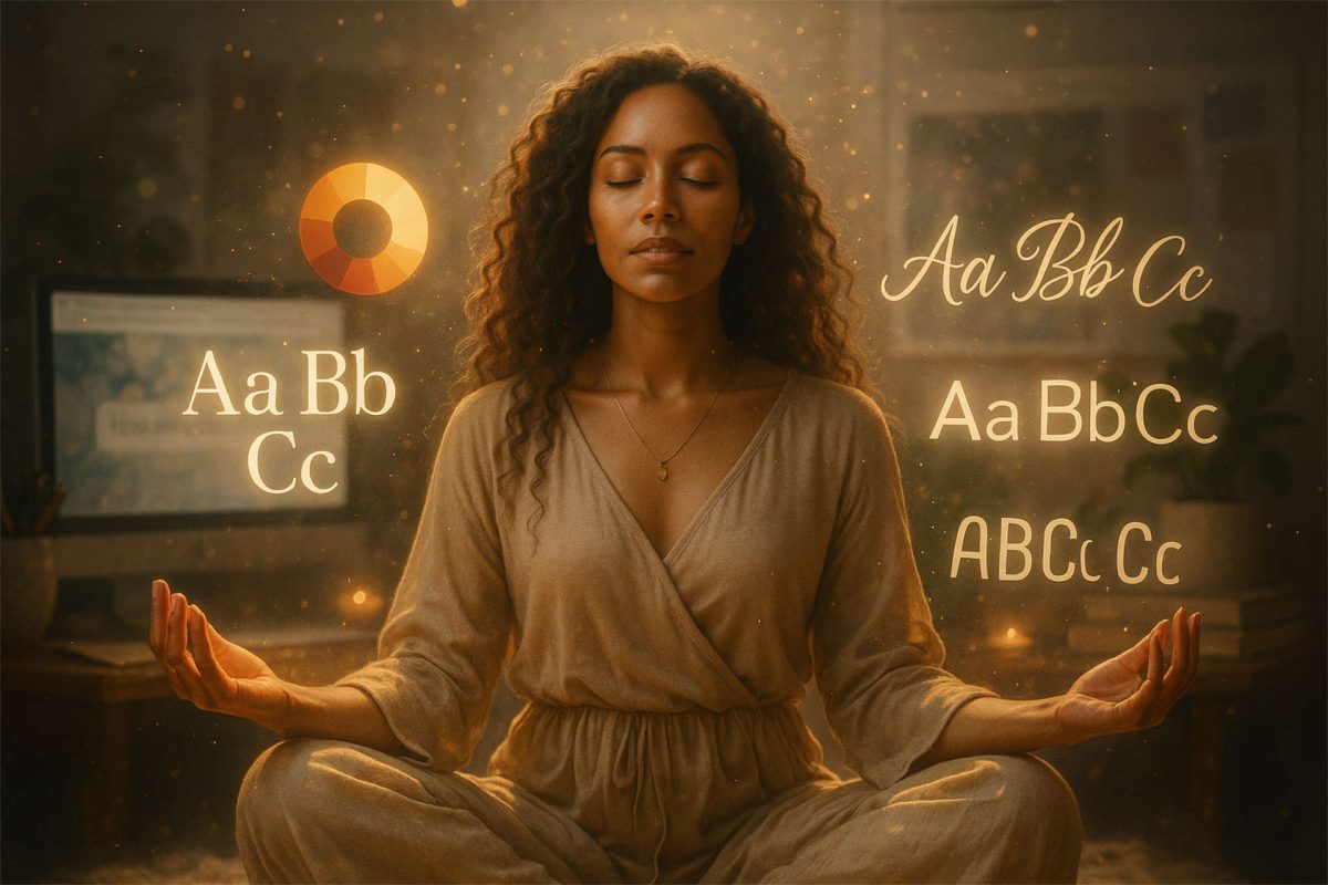
Your brand colors set the tone for how people feel when they land on your site or see your content. When chosen with intention, they shape connection and trust—and quietly reflect the energy behind your work.
Seasonal color palettes for branding offer a beautiful way to align your visuals with the natural rhythms of spring, summer, autumn, and winter. Each season carries its own emotional signature—and when your brand colors match that energy, your business feels more cohesive and magnetic.
Let’s take a look at how each seasonal palette can support your message and help you attract the people you’re meant to serve.
Why Do Seasonal Color Palettes Matter in Branding?
We’re surrounded by color every day—but most people don’t realize how much it shapes what we feel, notice, and remember. In branding, color plays a powerful role in creating connection and shaping perception.
Seasonal color theory adds a layer of intention. Instead of picking colors based on preference alone, it invites you to consider the energy and emotional tone you want your brand to carry. Just like the seasons in nature, each palette brings its own rhythm and resonance.
If you want to explore how color influences perception more deeply, check out this post on brand color psychology.
Here’s a look at what the colors of each season tend to evoke:
- Spring colors – bright, fresh, and full of energy; suggest growth and new beginnings
- Summer colors – light and calming; evoke ease, trust, and spaciousness
- Autumn colors – warm and earthy; convey coziness, depth, and authenticity
- Winter colors – cool, deep, and sophisticated; ideal for introspection and clarity
Aligning your brand’s color palette with the season that best reflects your energy can help you create a more cohesive and emotionally resonant experience—one your audience will remember long after they leave your site. For more ways to create consistency across your visuals, explore these website branding tips.
The Four Seasonal Color Palettes
Each seasonal palette carries its own energy and visual tone. Below are a few ways each one tends to show up in branding.
Spring – Fresh, Hopeful, and Full of Possibility
Spring palettes tend to feel light, hopeful, and alive. They’re the colors of beginnings—ideas just starting to take shape.
Soft greens and pale yellows often show up here, along with gentle lavenders—especially for brands rooted in growth, healing, or teaching.

A spring palette works beautifully for brands focused on healing and renewal. This website design for Positive Vybes uses soft greens and lavender tones to create a serene, renewing feel that invites gentle growth and ease.
A reiki healer, for example, might lean into soft green and lavender to support transformation without pressure — creating space for calm, trust, and possibility.
Summer – Calm, Open, and Easy to Breathe In
Summer palettes tend to feel open and spacious. They carry a sense of ease—like ocean air, wide skies, and unhurried mornings where everything feels just a little lighter.
You’ll often see soft blues, pale corals, and gentle yellows here, sometimes paired with airy neutrals. These colors work well for brands that want to feel welcoming and refined, without feeling heavy or intense.
Many brands naturally blend seasonal influences, with one energy tending to lead the overall experience.

A summer palette works beautifully for brands rooted in guidance, clarity, and trust. This website design for Kathy Mela uses soft blues and open space to create a calm, expansive feel that supports reflection and possibility.
Autumn – Grounded, Steady, and Full of Warmth
Autumn palettes tend to feel steady and rooted. They carry a sense of depth—like crisp air and falling leaves, or the comfort of familiar rhythms.
You’ll often see burnt oranges and warm browns here, paired with olive or mossy greens. These colors work especially well for brands that value authenticity and substance, and that build trust over time.
One example is KC Write Solutions, a copywriting brand that leans into earthy autumn tones. If you explore her site, you’ll see how we carried that warmth and grounded energy across every page.
Winter – Clear, Focused, and Powerful
Winter palettes tend to feel refined and intentional. They rely on strong contrast, deep tones, and clear structure to communicate authority and focus.

This website design we did for Kim Woods uses rich purples and high-contrast layouts to create a sense of confidence, clarity, and leadership—supporting a brand rooted in strategy and transformation.
How to Choose the Right Seasonal Palette
Choosing the right seasonal palette starts with understanding how your brand wants to feel — a reflection of your brand’s personality, not just how you want it to look.
Begin with your brand’s natural energy. Some brands feel warm and welcoming, others clean and modern. Some are playful, others steady and grounded. You don’t need to force yourself into a season — the right one usually reveals itself when you’re honest about how you show up.
From there, think about the people you’re here to serve. What do they need when they land on your site? Calm? Clarity? A sense of trust? Or a gentle nudge toward something new? Your colors help set that emotional tone before a single word is read.
It also helps to consider where your brand lives. A palette that feels beautiful on your website should still work on social media, printed materials, and anywhere else your visuals appear — without losing readability or cohesion.
And yes, accessibility matters here. Your colors should be easy to read and comfortable to experience across devices and platforms, especially when text is layered over backgrounds.
If you want support checking contrast and alignment, our Accessible & Aligned: Brand Color Review is a great place to start. You’re always welcome to email me if you want to talk through whether it’s the right fit.
Final Thoughts on Seasonal Branding Color Palettes
Color is more than a design choice — it’s a form of communication.
When your seasonal color palette aligns with your energy and message, it becomes easier for the right people to recognize themselves in your brand. They feel the resonance before they read the details.
If you’re ready to explore your seasonal color palette for branding more deeply, or you want support bringing your visuals together with clarity and intention, then our spiritual branding and design services are a beautiful next step.
Let’s create something that not only looks beautiful, but feels like you.
Based in Leland, North Carolina, I work with soulful entrepreneurs across the U.S. — from Wilmington to Asheville, Santa Fe to Sarasota — helping bring brand visions to life through thoughtful color, grounded strategy, and soul-led design.
Originally published on April 3, 2021 at barefootdc.com. Updated for Aligned Soul Design.