Coming up with the perfect small business logo design is about far more than selecting colors and shapes; it’s about capturing the essence of your brand and building a connection with your ideal clients.
For soulpreneurs and small business owners, a logo is a cornerstone of brand identity. It should embody your values—like alignment, trust, and purpose—while serving as a consistent, recognizable symbol across all platforms.
Since your logo is often your brand’s first impression, here are some tips to help you make your small business logo design one that leaves a lasting impact.
Define Your Brand’s Essence with a Mood Board
Successful small business logo design begins with a clear sense of your brand identity. A mood board is an invaluable tool to visually capture your brand’s style and personality. Use platforms like Coolors (fun tool for creating awesome color combinations), Pinterest, Canva, or Milanote to gather colors, textures, fonts, and images that resonate with your brand’s values and energy.
This process will not only inspire your design but will also help establish a cohesive aesthetic direction. By starting here, you set a strong foundation for the rest of the design process, ensuring that your logo reflects your unique brand identity.
Understand Your Target Audience
With a visual foundation in place, the next step is to clarify who your logo is designed to attract. Think about your ideal clients and what resonates with them. For example, if your audience seeks calm and reliability, cooler colors like blues and greens may communicate those qualities. If your brand appeals to vibrant, passionate individuals, warmer colors like reds and oranges could be more effective.
By understanding what your clients value, you can make design choices that speak directly to their preferences, increasing the chances that your logo will leave a lasting impression.
Quick Tips for Small Business Logo Design
Once you have a solid grasp on your brand’s essence and target audience, it’s time to start thinking about what makes a logo memorable. Begin by clarifying the message you want to communicate and how it aligns with your brand’s purpose. Reflect on themes like warmth, authenticity, or connection; these ideas will guide your design decisions.
Make sure every element of your logo serves a purpose. For example, the colors and shapes should reflect your brand’s core essence. A spiritually aligned brand might emphasize earthy tones and flowing lines, while a more dynamic brand could use brighter colors and structured shapes. This intentionality will help ensure your logo is both meaningful and memorable.
Research Competitors to Make Your Logo Stand Out
Now that you have a clear sense of your brand and your audience, it’s time to look at what others in your industry are doing. Competitor research can provide valuable insights into common visual themes, allowing you to identify opportunities for differentiation. Pay attention to elements like color schemes, fonts, and shapes.
If your industry is filled with bold, angular logos, perhaps a softer, more organic design will help your brand stand out. Differentiating your logo not only sets you apart but also reinforces your brand’s individuality.
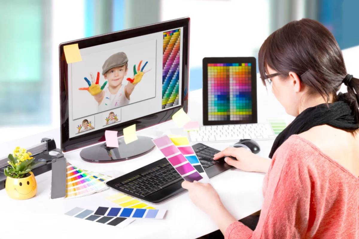
Design with Purpose: Choosing Colors, Shapes, and Fonts
With a foundation of inspiration and differentiation, you’re ready to dive into the details of your design. Each element of a small business logo design — color, shape, and font—communicates specific messages and emotions, so it’s essential to make thoughtful choices that align with your brand’s personality and goals.
The Power of Color in Logo Design
Color is one of the most powerful elements of a logo. Different colors evoke specific emotions and associations, making color choice a critical factor in conveying your brand’s essence:
- Red: This color symbolizes passion, energy, and urgency, making it perfect for brands that want to convey excitement or dynamism. Red can capture attention and provoke action, which is why it’s commonly used for brands that embody boldness and enthusiasm.
- Blue: Known for its calming, trustworthy qualities, blue is ideal for brands focused on reliability and stability. It evokes a sense of peace and security, which is why it’s often used by businesses in the finance, health, and technology sectors.
- Green: Evoking growth, nature, and health, green is a go-to for brands in sustainability, wellness, or eco-conscious industries. This color resonates with themes of renewal, harmony, and balance, making it ideal for nature-based or environmentally friendly brands.
- Yellow: Conveys optimism, warmth, and friendliness. Yellow creates an inviting and cheerful vibe, making it an excellent choice for brands that want to appear approachable, playful, or youthful.
- Orange: A blend of energy and friendliness, orange is vibrant and fun. It’s well-suited for brands that aim to exude creativity, enthusiasm, and innovation. Orange can stand out without being as bold as red, making it a balanced choice for creative industries.
- Purple: Often associated with luxury, creativity, and spirituality, purple lends a sense of mystery and elegance. It’s perfect for brands that want to appear high-end or imaginative, often used in beauty, wellness, and design-focused businesses.
- Black: Represents sophistication, power, and modernity. Black works well for luxury and high-end brands, providing a sleek, minimalistic look. This color can also convey authority, making it ideal for brands in fashion, technology, and professional services.
- White: Symbolizes purity, simplicity, and cleanliness. White pairs well with minimalistic designs and can make other colors stand out. It’s frequently used in health, wellness, and technology brands to convey clarity and innovation.
Understanding color theory helps you choose a palette for your small business logo design that enhances your brand’s message. For brands with a global reach, keep in mind that cultural differences can influence how colors are perceived, so consider researching color associations across different regions.
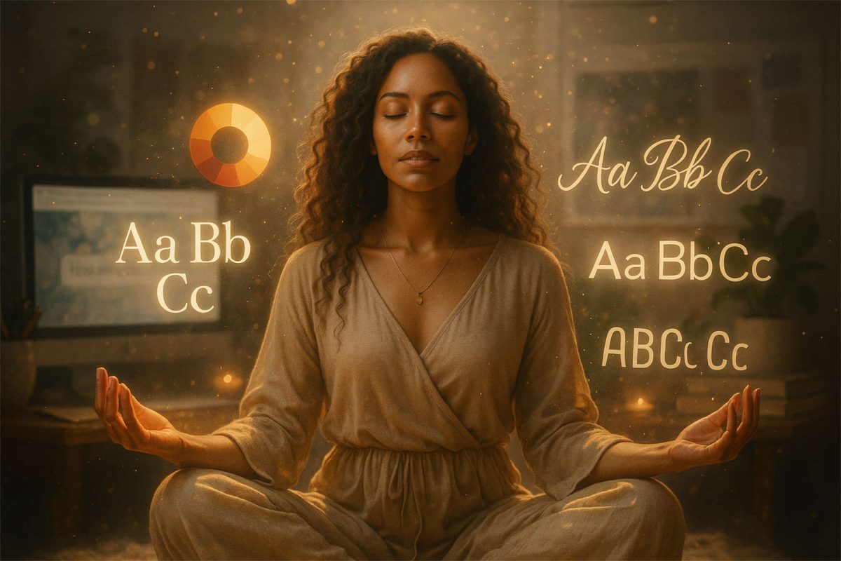
How Shapes and Fonts Communicate Your Brand’s Personality
In addition to color, the shapes and fonts in your logo play a significant role in how your brand is perceived. Here’s how to approach each of these elements strategically:
Shapes
Shapes are powerful in evoking specific emotions and can greatly influence how your brand is perceived. Rounded shapes—such as circles and ovals—tend to feel friendly, soft, and approachable, reflecting qualities of inclusivity and unity. On the other hand, angular shapes like squares and triangles project strength, stability, and modernity, making them ideal for brands that wish to convey boldness or a cutting-edge feel.
For soulpreneurs, organic shapes inspired by nature—such as waves, leaves, or abstract flows—can symbolize alignment, movement, and growth, aligning with themes of spirituality and personal transformation. By choosing shapes that resonate with your brand’s essence, you can further reinforce your message visually.
Fonts
Just like colors and shapes, fonts carry emotional weight and can say a lot about your brand. Serif fonts, known for their classic details, suggest tradition, reliability, and professionalism. They’re an excellent choice for brands that want to appear established or trustworthy.
On the other hand, sans-serif fonts are more modern and approachable. These fonts project simplicity and clarity, making them suitable for brands in creative or tech-driven fields. Script or handwritten fonts offer a sense of elegance and personalization, which can be great for brands focusing on artistry, creativity, or intimacy. Select a font that reflects your brand’s voice and reinforces the qualities you wish to convey.
Now that you’ve explored the essential elements of logo design, it’s time to evaluate your choices and ensure they align with your brand’s vision. In the next section, we’ll look at what makes a logo truly effective, highlighting the key principles of simplicity, memorability, and versatility.
Creating Effective Small Business Logo Designs
Creating a logo that’s simple, memorable, versatile, and relevant is essential for building a strong brand identity. At Aligned Soul Design, we place a high value on two additional factors: choosing the right logo type for brand alignment and ensuring that logos are scalable and usable across all platforms.
Logo Types and Their Differences
Understanding different logo types helps small business owners select a style that aligns with their brand’s identity, goals, and audience. Each type communicates a unique message:
Combination Mark: A blend of text and symbols, such as Adidas or Burger King, these logos offer flexibility and reinforce brand recognition. They provide versatility for different branding needs but require careful design to avoid looking cluttered.
Wordmark (Logotype): A logo style consisting entirely of the brand’s name in a distinctive font, like Google or Coca-Cola. These logos are direct, memorable, and easy to incorporate across platforms, but can be limiting if the brand name is long or complex.
Lettermark (Monogram Logo): These logos use initials for a compact and visually straightforward design. Think IBM or HBO. Lettermarks are great for brands with lengthy names that need a simplified logo but can require additional branding to clarify what the brand does.
Pictorial Mark (Logo Symbol): A pictorial mark uses a recognizable image, such as Apple’s apple or Twitter’s bird. Visually engaging, this type is ideal for established brands. New businesses may want to pair it with a wordmark until brand recognition grows.
Abstract Mark: These custom shapes don’t represent specific objects, but they do convey brand essence—such as Nike’s swoosh. Abstract marks offer versatility and broad appeal, though they can take longer for customers to connect with the brand.
Mascot Logo: Illustrated characters, like the Geico Gecko or KFC’s Colonel, add a personable and relatable element to a brand. Mascots are great for building emotional connections but may lack versatility for minimalistic or professional contexts.
Emblem Logo: Emblems combine text and symbols within a single, enclosed design, often associated with tradition and authority. Common examples include Starbucks and Harley-Davidson. Emblems look impressive but can be challenging to scale for smaller applications.
After exploring the different logo types, it’s essential to consider how your logo will perform across various platforms and sizes. An effective logo not only reflects your brand’s identity but is also adaptable and versatile. This ensures it maintains impact and readability whether displayed on a large banner, a mobile app icon, or business cards. Let’s look at the key factors that contribute to a logo’s usability and scalability across different mediums.
Scalability and Usability Across Platforms
A logo should adapt seamlessly across formats, from large banners to tiny app icons. Depending on the design, creating both horizontal and stacked versions ensures it fits perfectly in various applications, including website headers. A few best practices to achieve scalability include:
- Opt for Simplicity: Complex designs can lose their impact at smaller sizes. Clean lines and minimal details help your logo stay recognizable on any platform.
- Design in Vector Format: Using vector formats (like Adobe Illustrator) so logos can be resized without losing quality. This also makes it easier to export the logo in various formats for different uses.
- Create Color Variations: Providing logos in multiple color schemes—including black, white, and full color ensures you have a logo that works well on any background. Transparent and reversible color options allow for greater adaptability across print and digital platforms.
- Design for Favicons and App Icons: If your brand will have a website or app, a simplified version of the logo for use as a favicon or app icon is necessary. Often, this involves using just an initial or a symbol from the full logo for clarity at small sizes.
- Test Across Mediums: Envision each logo on various platforms, from business cards to social media profiles and product packaging, to ensure it stays consistent, cohesive, and recognizable everywhere.
By choosing the right logo type and prioritizing scalability, businesses can create logos that are visually appealing, versatile, and aligned with their values and goals.
Should You Invest in a Professional Logo?
After exploring these elements, you may be wondering whether to DIY or work with a professional designer for your small business logo design. While tools like Canva or Adobe Express offer accessible design options, a professional designer can provide custom work that truly captures your brand’s essence. Explore our branding services and bring your brand to life with a custom logo that’s scalable, versatile, and visually aligned with your values.
A professionally designed small business logo is also more likely to be versatile and scalable, meeting all your branding needs as your business grows. Assess your budget, time, and design goals to make the best choice for your brand.
Gather Feedback and Refine
Once you have a draft of your logo, gather feedback from trusted sources, including mentors, peers, and potential clients. This process can help you identify any elements that might need adjustment. Look for feedback on how well the logo communicates your brand’s essence and any suggestions that align with your vision. Refining your logo ensures it resonates with the people who matter most—your ideal clients.
Final Thoughts: Building Your Brand Identity with Small Business Logo Design
A well-designed logo is the foundation of a strong brand. By focusing on elements like logo type, scalability, and alignment with your values, you can create a logo that reflects your brand’s spirit and resonates with your ideal clients. At Aligned Soul Design, we specialize in crafting small business logo designs that are not only beautiful and memorable but also versatile and ready to grow with your business. If you’re ready to bring your vision to life, book a consultation today, and let’s create a logo that truly aligns with who you are.
Originally published on April 3, 2021 at barefootdc.com. Updated for Aligned Soul Design.